Okay, it’s about time I got around to this, so that we’ll be nice and up-to-date for when the next round of launches kicks off (Red Bull are scheduled to launch on the 9th, with Force India and Toro Rosso to be confirmed and the Williams livery to be unveiled at the opening race). It’s looking increasingly like, aside from the Renault, no team has actually bothered to make significant changes to their design this year – but let’s go through team by team and see if there are any differences we can spot, or points worth noting.
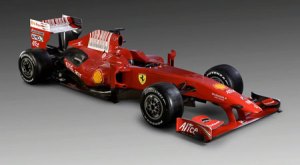
We start with Ferrari, first out of the blocks (as they were last year) and, of course, sticking with almost exactly the same livery (as they did last year). Ferrari only ever change things when they’ve got a new major sponsor – or if it’s an end-of-era type situation, as they did when making the design a bit more “futuristic” for the post-Schumacher era.
 They’ve gone with the same wider version of the “barcode” Marlboro fudging as was seen on the car for some of last season – it’s nowhere near as nice as the simpler version from 2007 and last year’s launch, to be honest. The sooner this weird, rule-bending half-association with Marlboro is over, and they have to actually put some thought into the liveries again, the better – sure, the cars always look nice, but they’re desperately unimaginative.
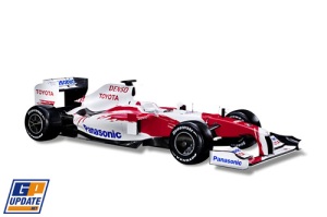
Speaking of desperately unimaginative… hey, it’s Toyota!
 I don’t think there’s ever been a team with such a bloody-minded determination NEVER TO CHANGE. Alright, so as we discussed at the time of the ’08 launch, they make minor changes each year, but essentially, it’s been THE SAME BASTARD CAR since 2002. And it’s BORING. Even moreso when you consider that, as I’ve mentioned repeatedly, we have too many predominantly white cars nowadays. For the record, this has been changed from last year (you wouldn’t know at a glance, but compare side by side and you get an idea), in that the red bits are back to being asymmetrical. But all that does is make it look like an older version, rather than something new. Sigh.
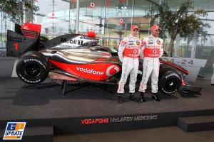
McLaren, meanwhile, haven’t got bored of the chrome look yet, and so are yet another team that are running a car almost identical to the last couple of years.
 There are a couple of points worth noting on this one, though. If we compare it to last year, it can be seen that the red/black lines that run alongside the nose no longer stretch past the cockpit. This is probably, along with the way the red on the sidepod seems to run for further, a consequence of the new shape of the car. Meanwhile, it could just be a trick of the light, but the red looks a bit brighter, and a bit less orange. To be honest, though, these things are difficult to judge at launch, and there would seem to be no practical reason to simply change the shade, so I doubt it’s really any different. And the other point to note is that, clearly proud of Lewis’ World Champion status, they’ve stuck his race number #1 on the rear wing’s endplate. It’s particularly interesting when you consider that they didn’t bother to do the same with Alonso’s 2007 car – clearly, the team feel differently about champions that actually won in their own machinery…
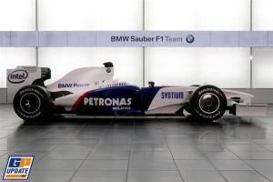
And finally, we have BMW. Once again, not a huge amount to say, with a basic paint scheme that only alters to fit the simpler lines of these ugly new machines :
 … but there are at least changes to note, and they’re quite obvious. The end of the sponsorship deal with Credit Suisse has left a gap on the car, with Intel moving to the rear wing endplate space (have they scaled back their involvement, too? They’re not on the front wing any more, either) It remains to be seen if the gap on the engine cover is going to be filled by a new sponsor before the season starts, but it’s interesting that BMW have chosen to put the old “BMW Power” text on the lower part – it’s somewhat reminiscent of their branding on the old Williamses. Oh, and Nick Heidfeld has a new, green helmet design – but I’ll be looking at all helmet designs once the season gets underway!
It’s a shame, really. I launched this blog to commentate on liveries, and over the last couple of seasons there’s been very little to talk about in the way of new designs (even less now that the number of teams in the sport is shrinking). Still, I’m hoping to keep things going (and I do mean it, this time!) with some more “history”-based articles, so hopefully that’ll see us through a barren year of paint-job-related excitement!


 Posted by Seb Patrick